From Research to Design – The Journey of a “Noob” Designer
(Part 2 of 2 - Design)
I’ve always considered myself as a “design researcher” or a “social scientist of design.” As most designers would agree, it’s one thing to research or critique designs; it’s another to actually design, often within the constraints of time, resources, and creativity.
In the second part of my capstone project, I documented my “design journey” for my capstone project (A-I) – a platform providing mentorship for PhDs and postdocs transitioning from [A]cademia into [I]ndustry.
Ideation
Mapping the Experience: Site Map
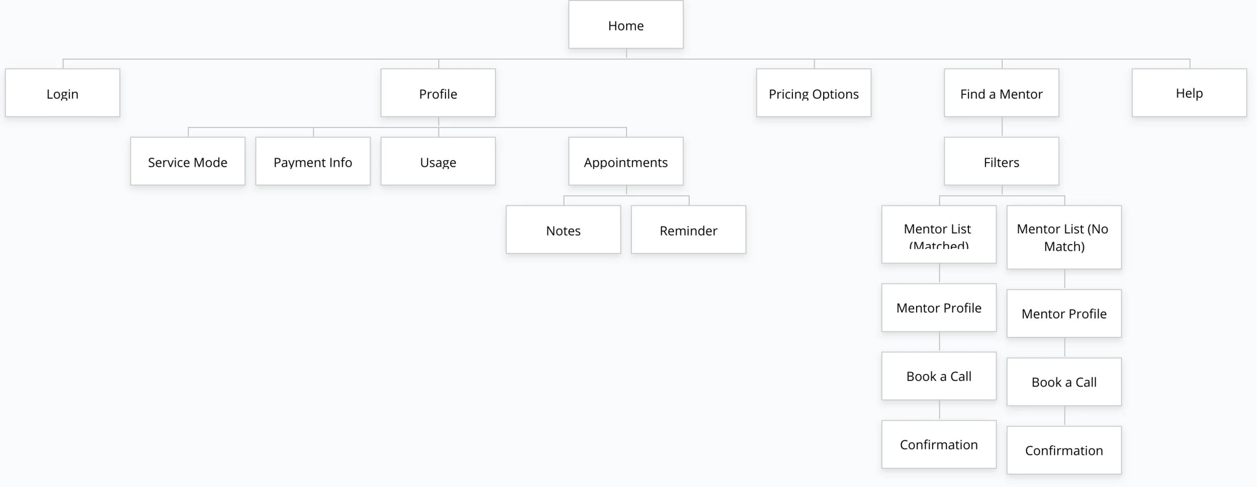
Now that I have a concrete problem to address (i.e., the lack of opportunities for mentorship for PhDs and postdocs planning to transition to the industry), a sitemap is a great tool to think about the screens I will need to design.
Sitemap.
Mapping the Experience: User flow
Next, I considered the ways users could navigate through my site, and the user flows critical to my design to keep me on track during the prototyping phase. For this project, users must be able to (1) find a mentor, (2) select and book a mentor call, and (3) provide payment information.
User Flow: Finding a Mentor.
User Flow: Confirming a Mentor.
“Always move forward with purpose.”
-Jeffrey, Lead Researcher and Designer
Prototyping
Paper Prototype
I sketched the key screens based on the site map and user flows.
Initial Sketches: Finding a Mentor.
“I continuously remind myself to be 'quick and dirty.' Focus the key features. Nothing more, nothing less.”
-Jeffrey, Lead Researcher and Designer
Testing
Guerilla Usability Testing
I conducted five guerilla usability testing. Participants were shown different paper prototypes from the website and asked to think aloud as they performed various tasks.
Key Goals
1. To determine if participants experienced confusion with any screen or scenario.
2. To determine if participants found any feature(s) to be useful or redundant.
3. To solicit feedback on these tasks: (1) finding a mentor, (2) booking a call, (3) selecting a plan, and (4) providing payment information.
Key Findings
1. Finding a mentor: Two participants were confused as to why the number of mentors displayed on a screen did not match the number of “mentors found.”
2. Booking a call: Two participants reported that using the word “Book” on two consecutive screens was repetitive, felt they were doing the same action twice.
3. Selecting a plan: Three participants had a problem identifying the “Pay it Forward” button; assumed the “Pay it Forward” will be as salient as “Pay it Now.”
4. Selecting a plan: Participants were generally confused by the pay it forward plan.
“You can’t assume people know what 'Pay it Forward' meant. It needs to have some explanation. I’m seeing this for the first time.”
Travis, PhD in Management
Design Decisions
1. List of mentors: A new button “See X more mentors” will be added at the end of the screen to indicate there are X more mentors that a user could see.
2. Booking a call: Replace “Book” with “Next” so a user knows there is another step (i.e., to review the appointment) before a confirmation.
3. Selecting Plan: Removed “Pay it Forward” feature.
4. Confirmation: Replaced “Email T&C” with “Email Terms and Conditions.”
“As the designer, I’ve spent considerable time conceptualizing the “Pay it Forward” plan. While it was disappointing to scrape the idea, it was the case of 'better now than later.”
-Jeffrey, Lead Researcher and Designer
Ideation
Wireframes
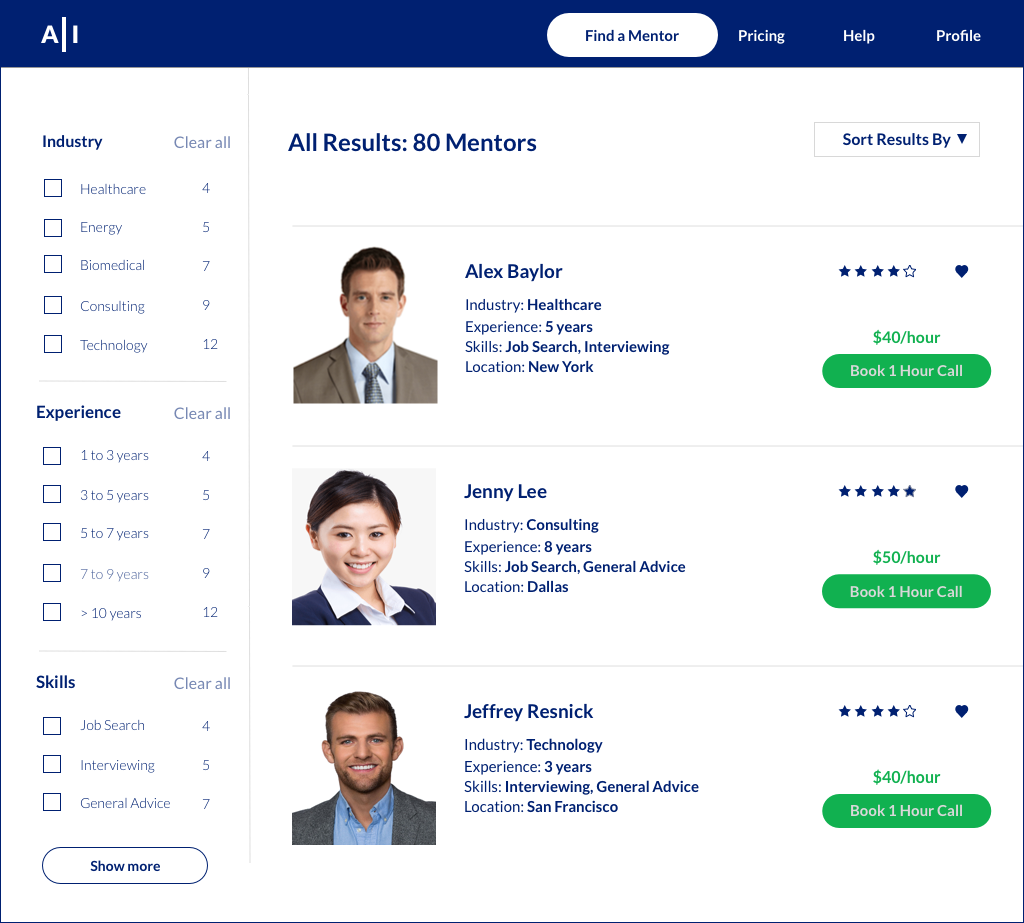
To map the site’s content, I create wireframes the red routes. The wireframes were an excellent way to define the hierarchy of different elements. They helped determine the layout of the site. I also used real content to determine if it fits well within the wireframe.
Wireframes: Finding a Mentor.
“After developing the wireframes, I was horrified to realize that my proportions were all wrong. While I chose not to revise my wireframes due to time constraints, I did, however, made careful choices about font sizes before developing high-fidelity prototypes.”
-Jeffrey, Lead Researcher and Designer
User Interface Design
Style Guidelines
I created a style guideline to keep my designs unified as I make design decisions and build mockups.
Style Guidelines.
From Style Guide to High-Fidelity Mockups (1-2 screens)
Style guides are an important design tool; they help UX designers to keep their designs unified as they make design decisions and build mockups. After creating a style guide, I applied the elements to create a high-fidelity mockup to see if these elements work.
“A style guide isn’t set in stone. Iterate on your style guide as you design 1-2 high-fidelity mockups screens.”
-Jeffrey, Lead Researcher and Designer
Call to Action. For the call to action button, I used a bright green color to ensure it stands out from other design elements.
Using a bright green color to ensure that the call to action stands out from other design elements.
Font sizes and weights. I adjusted various font sizes and weights to provide higher contrasts and visuals relative to other design elements. I also played with different spacing to create distinctions between features and functions.
Using various font sizes and weights to provide higher contrasts and visuals relative to other design elements.
Using spaces to create distinctions between features and functions.
“Always look at design elements in its intended environment. An element may work in a style guide, but not on a website.”
-Angelo, Springboard Mentor
Creating the Full Set of High-Fidelity Mockups
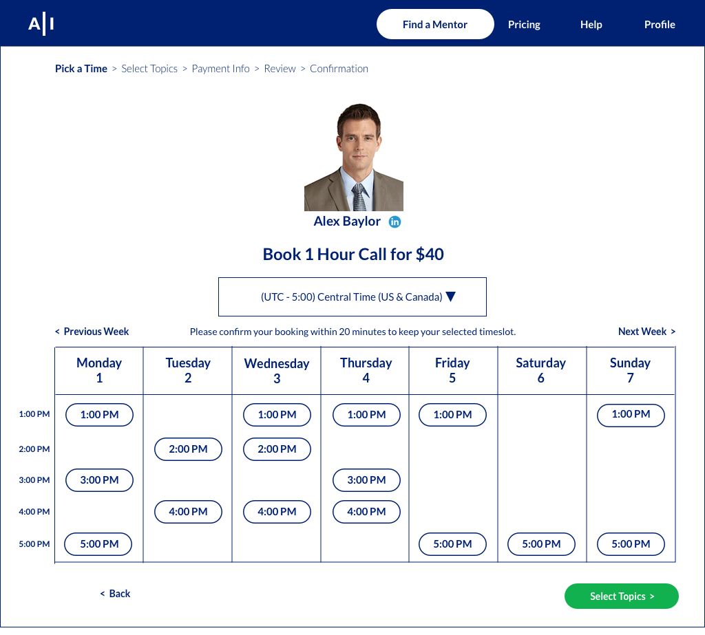
Selecting a time and date for the mentor call. I added lines between the times and days to make it visually easier to see or help users “zoom in” on a specific area, such as a day or time. I also added times by the left side to quickly indicate to users the number of available time slots. Even for a simple calendar feature, it is important to consider users’ expectations while interacting with the features and provide appropriate controls.
For example, I initially excluded the “continue” and “back” button to reduce unnecessary visual information, and users will see the next screen once they have selected a time. However, it may also create frustration whenever users chose the wrong time and having to redo the entire process. Instead, users will now have to select a time and click on “continue” as a way of confirmation.
Lines help provide visual separation. Provide enough information to facilitate comprehension and navigation.
“As a designer, less is more. But this principle should not be at the expense of providing too little information for users or having users spend too much time trying to figure things out.”
-Jeffrey, Lead Researcher and Designer
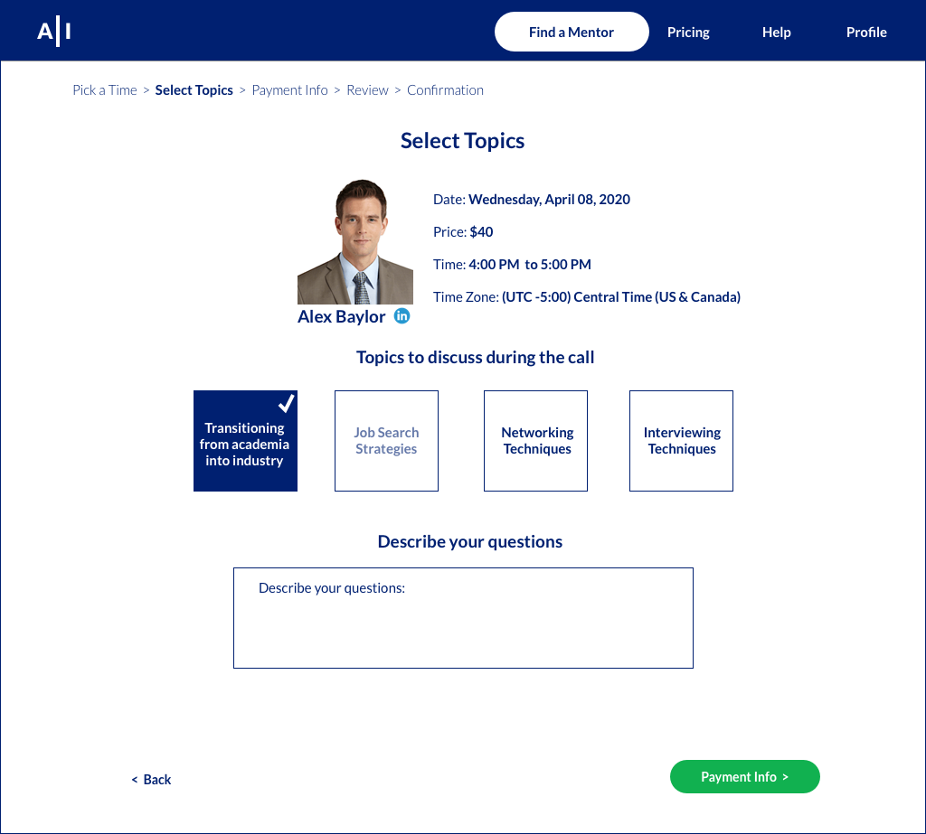
Selecting topics to discuss during a mentor call. I initially designed a dropdown menu with only four topics. However, given the white space remaining on the screen, I presented all the topics and reduced a step (i.e., users clicking on the dropdown menu and then selecting the options) in the interaction process.
Showing users all the possible topics instead of a dropdown menu.
Confirmation page and empty state design principle. Empty states are messages that users see on their display when there is no content to show. However, empty states are an excellent way to empower users by providing them with calls to actions that guide them towards something of consequence, e.g., preparing for a mentor call. Applying the concept of empty state design to the confirmation page was a great way to drive engagement and remind users of the value of A-I, i.e., providing a holistic approach to mentorship.
Confirmation page and visual distinction. Given that the confirmation page was the last step in the user flow, I wanted to create a visually distinctive design different from other screens. Instead of a white background (like other pages), I created a blue background with white contrasts. I also added icons to create a visual distinction between the “Confirmation” and “Mentorship Resource” sections.
Empty state design: Providing users with mentorship resources on the confirmation page.
Blue background with white contrasts creates a visual distinction relative to other pages and helps to “signify” the end of the user flow.
“Useful empty states: Tell users what it’s for, why you’re seeing it, and how to fill it up.”
-Jeffrey, Lead Researcher and Designer
Lines and borders. I initially used different shades of grey for lines and borders. However, to keep a consistent design language, I referred to my style guide and used blue instead.
Using blue lines across different screens to keep a consistent design language.
Synthesizing & Redesigning (After Round 1 of Usability Testing)
After conducting five moderated usability tests, I incorporated the feedback and insights to iterate on my prototypes. Key considerations include:
What are the critical or major issues I uncovered? What are design solutions for each issue?
What are the minor issues? How do I plan to prioritize this list of issues?
Overall, there were two, five, and nine critical, major, and minor issues, respectively. For brevity, below are examples of highlighted issues and my design iterations.
Critical Issue #1 (Mentor’s Profile)
Users expect to see more information on a mentor’s profile and won't book a call with the current level of information.
“I need to see some reviews. Otherwise, it’s hard to decide.”
- Jacob, Postdoc in Widelife Conservation
Design Iteration #1 (Mentor’s Profile)
Based on preliminary insights from this round of usability testing, I created a “popup” profile that includes a mentor’s job experience, educational experience, and reviews from past mentees.
Before: The mentor’s profile provides too little information.
After: The mentor’s profile provides information on the job experience, educational, and reviews from past mentees.
Critical Issue #2 (Payment)
Users were confused by the language used on the payment page and do not understand how the “Pay for Minutes” system works.
I know paying for a mentor call each time you book a call seems like an extra step. But this is necessary, and I won’t mind doing it.
-Jacob, Postdoc in Widelife Conservation
Design Iteration #2 (Payment)
Instead of “Pay for Minutes,” users will now pay for a mentor call with each booking.
Before: The payment plan is confusing to users, particularly with language such as “Top Up.”
Major Issue #3 (Review Page)
Users need to see a review page, before booking a call.
“What have I done so far? I need a review page to refresh my memory.”
-Jee Eun, PhD in Human Behavior
Design Iteration #3 (Review Page)
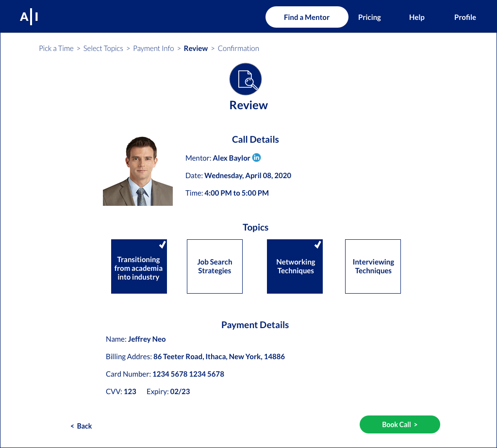
I’ve included a review page and used the second round of usability testing to assess this new page.
Before: Users do not get to review key information before booking a call.
After: Users get to review key information before booking a call.
Synthesizing & Redesigning (After Round 2 of Usability Testing)
After adjusting my prototypes, I conducted another round of moderated usability test with five new people, focusing on the two new screens: the mentor’s profile and the review page. Key considerations include:
Are the critical or major issues uncovered from the first round of usability testing still an issue?
Are there any new usability issues, particularly for the latest screens?
Minor Issue 1 (Mentor’s Page)
Users do not want to see all the information on one page and want to see a variety of reviews.
“The information is good. However, you can put them in different tabs. Also, I want to see more reviews. Like a range of reviews.”
-Galib, PhD in Chemistry
Design Iteration 1 (Mentor’s Page)
I used a “tabbed” feature to present the information.
Before: Users see all of a mentor’s profile on a “popup” page.
Mockup: A mockup of the new mentor’s profile page to see if this layout works from a visual standpoint.
After: Users can see different aspects of a mentor’s profile by click on the various tabs.
After the second round of usability testing, the design phase for this project is completed (for now)!
Reflections
As a “noob” designer, it was challenging to articulate my design ideas. We see good (and bad) designs every day and this project has made me appreciate the value of simple, effective, and meaningful designs. Besides acquiring some design skills (I sure hope!), I am now more critical and aware of the designs I see, and reflecting on these designs from multiple perspectives, such as form and function. As a design researcher coming from an academic background, this was also my first true design project that involved users from start to finish. The process was tiring and frustrating at times, but certainly rewarding to know that at the end of the day, I’ve design with my users, and not for my users. Lastly, here are some tips from my industry mentors that guided me in creating better designs.

